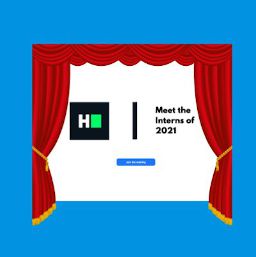
The inception
The time was noon, it was business as usual at HackerRank. We, the recently recruited interns, were logging into our weekly Zoom call with the CTO of HackerRank and met with the words, “Here’s a challenge for you guys.” All eyes and ears were trained on the screen intently, as he explained to us that we had to make a webpage – a place where the world could meet and greet us interns – before the 15th of February and if we failed to do so, we were to face just one consequence – spending an entire day of Zoom meetings dressed in formal clothing. Invigorated and slightly scared at the prospect of wearing corporate attire for a day, we immediately set out to bring the 2021 interns’ web page to life.
In this blog post, we’ve attempted to provide a behind the scenes look at the process of building this webpage:
- Splitting up
- Designing the webpage
- Making the mouse-following feature
- Waving hello
- Developing the chatbot
- Collecting images and videos
- Eager loading
- Making it responsive
- Wrapping it up
Splitting up
First, we divided ourselves into 3 teams – one dealing with design and two with code (more specifically, one to build a clone of the Zoom call interface and another to build a clone of its chat box). While the design team started creating low-fidelity to high-fidelity wireframes, the other two kicked off the project by building bare bone logic. To establish accountability within ourselves, we decided that every feature that each team builds should be reviewed by other teams before it was merged.

Designing the webpage
For our design needs, we decided to use the trusty interface design tool Figma; a quick watch of this tutorial video taught us everything we needed to know to start designing our webpage. We began with the basic template for the tiles, which was a 4×4 grid, and then went on to create the buttons and border details from scratch. The component in which we got to express ourselves creatively the most, was the landing page (notice the arcs!)
Making the mouse-following feature
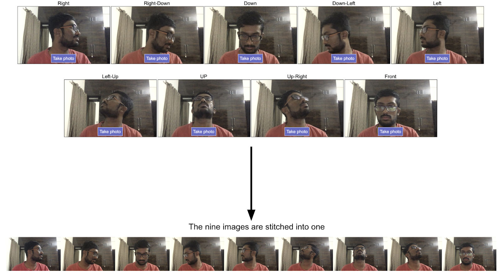
One of the main features of the interns’ webpage is that the faces of the interns follow the mouse cursor. The idea was inspired by this website.
Finding the angle that the face needs to point toward was easy. With a bit of coordinate geometry, we could determine the nearest 45 degree angle image to load.
The initial approach was having 9 different images and changing the image.src every time the angle changes. At first, this seemed to us like the most uncomplicated route to take. However, once we started loading the images for every intern, we noticed the images flickered when they changed – this happened because every time we change the image src, the browser needs to buffer a new image into memory. So, even though the image is cached, there is a flicker.
The solution, we figured, was setting the background image using the CSS “background-image” property instead of using the images directly. So there was now a single buffered image and we could decide which part of the image was visible by setting the background offsets. There was no flicker after we implemented this.
Waving hello
Everybody knows and loves gifs – it’s the de facto standard on the internet for short videos on a loop so we wanted to incorporate it into our website and decided to do so through “hello” hand waves that the viewer will be greeted with as soon as they enter the Zoom call. However, our experience with gifs was not unhindered – they suffered from colour loss, poor quality, low frame rate and huge file size. We were stumped because the gifs we came across on other websites like Twitter and Reddit looked flawless. We researched into how these websites deploy gifs and as it turns out – they don’t use gifs. Instead, they convert them to video and render them using the <video> tag, so we scratched our initial approach and did the same.

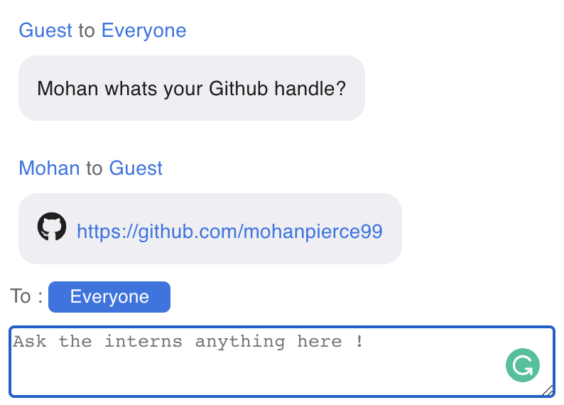
Developing the chatbot
Chatbots are like store greeters – welcoming you, helping you navigate and answer all your questions promptly so, users generally enjoy experimenting with this feature on websites. We decided that we wanted a full fledged AI Chatbot powered by Dialogflow. Its purpose was to carry out small talk, tell jokes and interact with users in a friendly tone.
Building a chatbot on Dialogflow is fairly easy. With a bit of work, we can quickly have a fully functional smart bot. However, the task of integrating the chatbot with the interns’ webpage was not straightforward. We couldn’t authenticate with Dialogflow directly from the client side as we cannot expose the api keys on the client.
A solution was to have firebase as a backend proxy to Dialogflow. We even built and tested it – it worked fine, but we decided this was overkill for a simple webpage like ours. We were still determined to have a chatbot, so we experimented with a fuzzy logic approach. We limited the bot to answer one type of query – “Tell me X about Y” where X can be terms like Github, LinkedIn etc. and Y could be a person’s name.
The heaviest part of writing the fuzzy logic was thinking of all the cases and formats in which the user could ask a question. We wanted the system to be robust in handling spelling mistakes and variations in sentence formation. So, we split the sentence into words and conducted a fuzzy search with each word to detect context. Then from the context, we were able to frame the responses for each query.
Collecting images and videos
We needed to capture the images and record the videos in a very specific manner. The numbers we decided upon were:
- Image resolution – 592 x 368
- Image quality – 0.8
- Image format – jpeg
- Video resolution – 296 x 184
- Frame rate – 15
- Time – 1.5 secs (but since it was looped, it was a total of 3 seconds.)
There were a total of 9 images which had to be captured by each intern – each one with a different pose and an introductory hand wave video. In order to remove human error and to make this task as easy as possible, we developed a firebase app to collect the media assets. The app made sure the images and videos were of the right specifications, and the intern could test the mouse following feature right there and update any image if required.
Firebase has some incredible features and is easy to get started with. We used it to:
- Host the web application
- Carry out a Google authentication + Constraint that only HackerRank users can use
- Automatically upload media assets to Firebase Storage

Eager loading
Eager loading is the lesser known cousin of lazy loading. While lazy loading refers to loading assets only when required (to save bandwidth and other resources), eager loading refers to loading assets beforehand. Both are very useful in different scenarios.
In our webpage, we had lots of assets – a total of 64 media assets, to be exact. Usually when there are many assets, the rule of thumb is to lazy load them. However, in our use case, if we changed the image source or video, the webpage would need to load the image/gif/video and it would’ve had to download the same – so it was slow. However, the next time the asset was needed, it would’ve loaded faster because it would be cached by the browser so this problem would’ve been encountered by first time users only.
Still, we wanted to eliminate it for good. The solution was fairly straightforward, we just eager loaded the assets in the background, allowing the browser to cache the assets. Then later when the browser needs these assets, it could load it quickly from the cache.
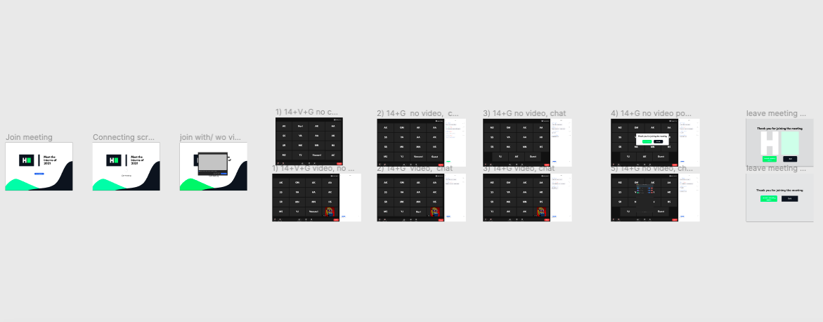
Making it responsive
The UI had to be responsive for smaller (than a desktop) devices – this meant handling the site layout at various widths – xs-mobile, mobile, tablet, and this was carried out using media queries. Depending on the width of the window, the participant tiles get rearranged from 4X4 -> 1 to 2X2 -> 4 slides. Instead of the 4×4 grid on desktop, we made a carousel with 4 participants per slide for the mobile view. Apart from this, the click actions were changed such that the hand wave gif for the participant was shown in the chat box instead of the main carousel.

Wrapping it up
Besides the expected bugs, we were in for a last-minute challenge – a new intern was added to the mix. We had to make space for them in our Zoom call, so we decided to toggle between showing our HR representative and our CTO alternatively. After 82 PRs consisting of 203 commits, we could heave a sigh of relief; our interns’ web page was finally complete. As for the challenge, it ceased as a draw – both us and the CTO donned formal clothing for a whole day, and the jury is still out on whether it was a collective win or a loss for all of us.

This page was just another addition to the goldmine that is the collection of interns’ web pages on our website – the one made by 2020’s interns featured a Whac-A-Mole game, and the one made by the 2019 interns had surprises in store as we hovered our cursors over the interns’ portraits while the 2018 interns’ web page bedazzled us with pop art colours and entertaining gestures. We can only hope we’ve lived up to these ones who came before us, and wish the next batch of interns good luck!
Leave a Reply